Exploring by Prototyping
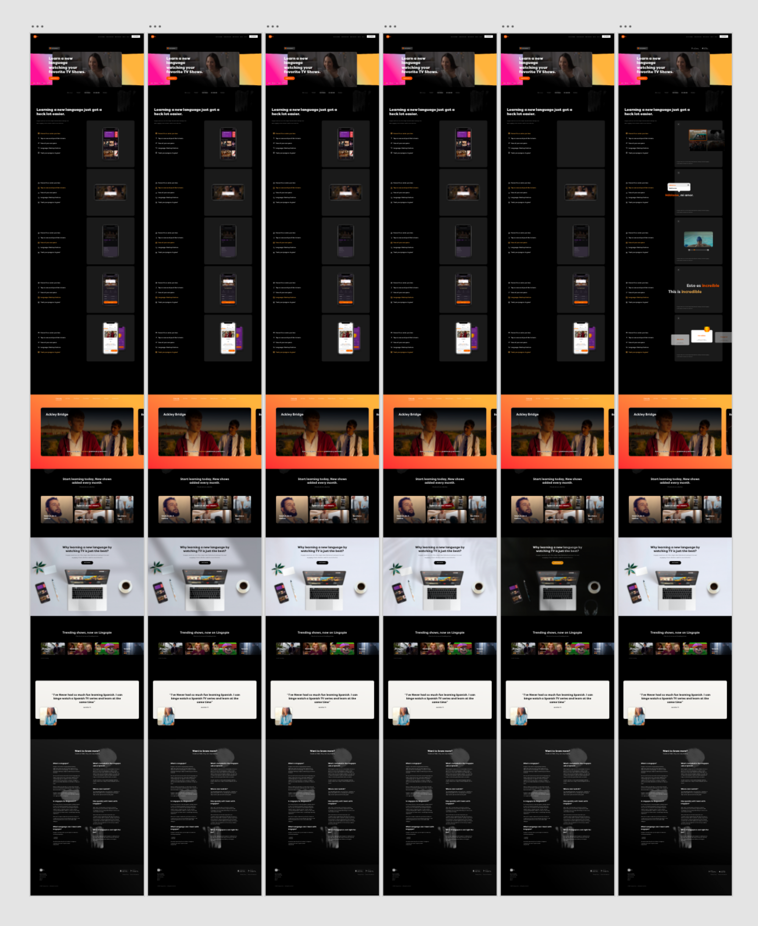
Before diving into more details there was a need to test how the new experience should be different, and by it’s core, in what direction we’ll need to go in terms of color pallets, typography, graphic elements, imagery and basically everything else that graphically defines a new tone to the design. The directions that were on the line on the first sketches were Dark Grey, Purple and Lingopie’s Orange, and another direction that is based on white and actually bring the design more closer to the Productivity Sector rather then Multimedia, which obviously the brand is somewhere in between.

Evolving the direction
The choice was to go with a fully dark, black based designs that is very much connected to the world of television. It’s a very much simplistic approach where most of the design is dark, content and texts presented in a very clear way in white typography. With that we were able to utilise Lingopie’s brand colour for highlights and accents.